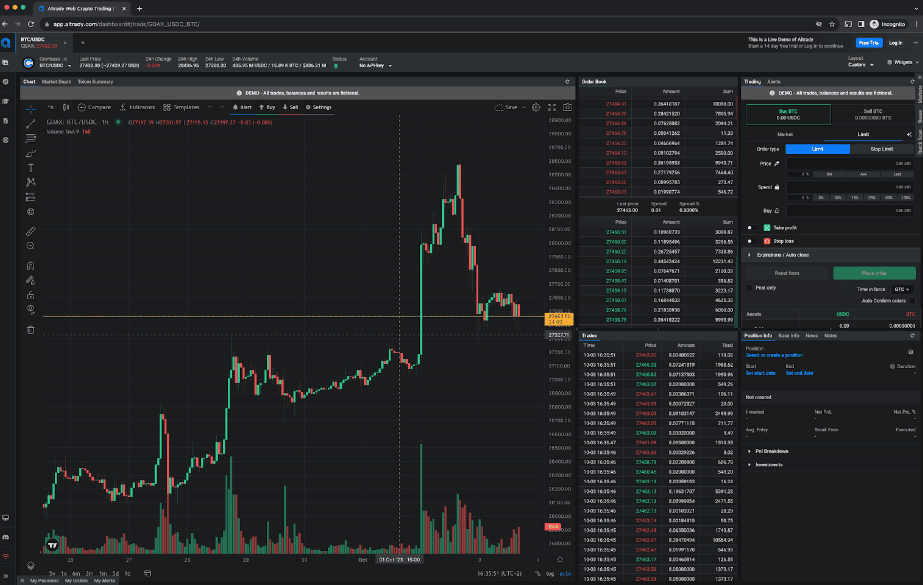
Line and bar charts are powerful visual tools used when trading crypto. It’s the chart that stands out in a sea of numbers like the order book and fills on trading terminals. That’s because humans are way better at interpreting a visual chart than lists of numbers.
In essence, a well-interpreted chart can make the difference between capitalizing on a market opportunity and missing it.
Now, let’s explore why mastering Line&Bar charts is non-negotiable for every serious crypto trader.

Why Every Crypto Trader Should Know About Line & Bar Charts
Line and bar charts help you in terms of:
1. Informed decision-making: charts offer a quick snapshot of historical and current market behavior, enabling traders to base their decisions on data rather than gut feelings.
2. Spotting trends: recognizing bullish (upward) or bearish (downward) trends early can help traders anticipate potential price movements and act accordingly.
3. Understanding volatility: especially prevalent in the crypto market, volatility can be better visualized with bar charts, allowing traders to assess the risk and potential of specific investments.
4. Better timing: by identifying key support and resistance levels on charts, traders can optimize their entry and exit points in the market.
5. Continuous learning: the crypto market is ever-evolving. Regularly reading and interpreting charts enhances a trader's analytical skills and adaptability to market changes.
What Are Line Charts
A line chart is a type of graph that displays an asset’s historical price action by connecting a series of data points with a continuous line. It’s commonly used in finance to depict a security’s closing prices over a specific time frame, like day-to-day price changes.
Check out this example below:
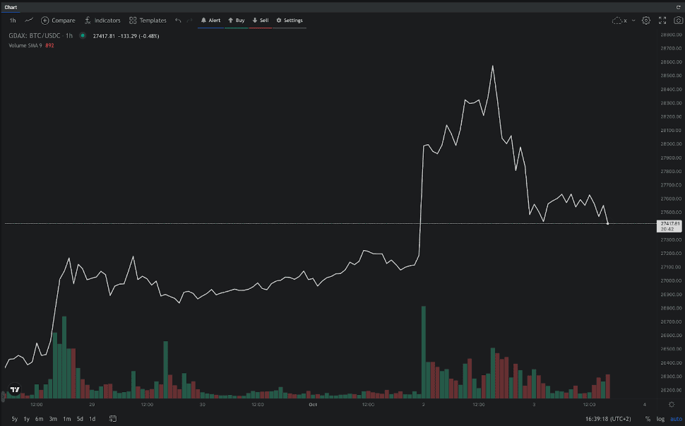
Line Charts Applications
A line chart provides traders and investors with a clear depiction of price movement over time. Plotting closing prices on a line chart helps reduce noise from less critical times in the trading day, like the open, high, and low prices. This simplification allows for a focused representation of the asset's price action and facilitates identifying key patterns and trends.
Line charts serve the purpose of providing a snapshot of a market’s activity, allowing traders to analyze price movements and make informed trading decisions. They’re particularly useful for identifying support and resistance levels, recognizing chart patterns, and observing overall price trends.
Advantages of Line Charts
- Simplicity
Line charts are easy to read and understand, making them ideal for beginners. They provide a straightforward visualization of price movements, teaching basic chart reading skills before diving into more complex chart types.
- Identification of trends
Line charts allow traders to identify trends in an asset's price movement over time. By focusing on closing prices, they provide a clear picture of whether the price is generally increasing (upward trend) or decreasing (downward trend).
- Support and resistance levels
Line charts make it easier to locate key levels of support and resistance. These levels indicate the price levels at which an asset is likely to encounter buying or selling pressure, providing valuable information for traders.
Limitations of Line Charts
- Limited price information
Line charts only display closing prices, excluding other important price data such as the open, high, and low. This limited information may not be enough for some traders who rely on additional data points to develop and monitor their trading strategies.
- Potential oversimplification
While line charts provide a clear representation of trends and support/resistance levels, they may oversimplify the complexity of price movements. Traders who require a more detailed analysis of price patterns and fluctuations may find other chart types, like candlestick charts or bar charts, more suitable.
These limitations are largely mitigated when line and bar charts are used concurrently, providing a comprehensive view of both rapid and gradual market movements.
In conclusion, line charts serve as a foundational tool for financial analysis, simplifying the visualization of price movements over time. These charts are invaluable for beginners due to their clear illustration of trends and support/resistance levels. However, for a more comprehensive grasp of price patterns, experienced traders often integrate additional chart types or use them alongside line charts.
One example of these additional chart types is the bar chart, explained in detail below.

What Are Bar Charts
A bar chart is a visual representation of data using rectangular bars, with each bar representing a specific category or value. Bar charts are commonly used in various fields, including finance, to display and compare data sets.
Let’s delve into the purpose of bar charts, different types of bar charts, and the significance of bar patterns.
Bar Charts Applications
Bar charts, also known as bar graphs, provide a straightforward way to present data in a visually appealing and easy-to-understand manner. They consist of vertical or horizontal bars that correspond to different categories or values. The length or height of each bar shows the magnitude of the data it represents.
The primary purpose of using bar charts is to showcase comparisons between different categories or track changes over time. They allow you to identify patterns, trends, and disparities in the data quickly. With its simplicity and versatility, bar charts are widely used across various industries and research fields.
Next to the bar form, in financial applications, the color is also important. The color of the bar, traditionally red or green, is a powerful indicator of market sentiment and dynamics within that time frame.
A green (or sometimes white or blue) candlestick denotes a bullish period, signifying that the closing price was higher than the opening price. This color reveals a time of dominant buying interest, pushing prices upwards, and is an immediate visual cue of a price increase.
Conversely, a red (or sometimes black) candlestick signals a bearish period, indicating that the closing price was lower than the opening price. This color reflects selling pressure in the market, leading to a decrease in price.
Different Types of Bar Charts
Most trading terminals such as the Altrady trading platform make use of these different bar charts;
Candlestick Charts
|
OHLC Bars
|
Hollow Candles
|
Heikin Ashi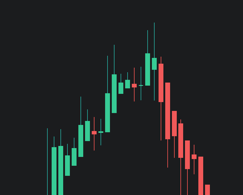
|
-
Candlestick Charts:
- Most popular for trading, displaying open, high, low, and close prices.
- Each 'candle' represents a specific time frame, showing price movement.
-
OHLC (Open-High-Low-Close) Bars:
- Similar to candlesticks but represented as bars.
- Provides a clear visual of the trading range for each period.
-
Hollow Candles:
- Variation of candlestick charts, where each candle is hollow or filled depending on price movement.
- Useful for visually emphasizing a trend’s direction.
-
Heikin Ashi:
- Modified candlestick chart that filters market noise and highlights trends.
- Calculated using average prices, making it smoother than traditional candlesticks.
Bar Patterns
Bar patterns refer to specific configurations and arrangements of bars within a bar chart. These patterns often provide valuable insights into the data and can help identify trends or anomalies.
Here are the most common bar patterns:
- Upward trend: a series of bars showing an increasing value over time or across categories indicating an upward trend; this pattern can be indicative of growth, positive performance, or improvement.
- Downward trend: a series of bars showing a decreasing value signifies a downward trend; this pattern may suggest a decline, negative performance, or decreasing values over time or across categories.
- Irregular or volatile pattern: some bar charts may exhibit irregular or volatile patterns, with fluctuating values across categories or time periods; these patterns might indicate unpredictability, variability, or inconsistency in the data.
-
Uniform or flat pattern: when the bars in a chart show consistent values across categories or time periods, it creates a uniform or flat pattern; this pattern suggests stability, equal distribution, or lack of significant changes.
By analyzing these bar patterns, analysts and traders can gain insights into market trends, investment opportunities, and the overall performance of different categories or variables.
Keep in mind that bar charts are just one visual tool among many, and their effectiveness depends on the context and nature of the data being presented.
Conclusion
In conclusion, line charts and bar charts stand as indispensable tools for technical analysis and interpretation. Line charts offer a streamlined visual representation of trends and patterns unfolding over time, serving as a guide for forecasting and understanding market momentum. Bar charts, often seen in the form of candlestick charts, provide detailed insights into the market’s open, close, high, and low prices within specific time frames. Each chart type brings its unique set of advantages to the table.
In the intricate and volatile domains of finance and cryptocurrency, the strategic use of line and bar charts isn’t just beneficial but essential for informed decision-making and effective analysis.
By incorporating line charts and bar charts into your data analysis, you can gain a deeper understanding of trends, compare data effectively, and make informed decisions in the rapidly evolving world of finance and cryptocurrencies.