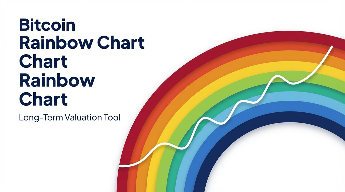
What Is the Bitcoin Rainbow Chart?
The Bitcoin rainbow chart is one of the most visually distinctive tools in crypto analysis. At its core, it overlays a series of color-coded bands on top of Bitcoin's historical price chart, stretching from deep blue at the bottom to dark red at the top. Each color represents a different market sentiment zone, ranging from "accumulate" in the cooler tones to "maximum bubble territory" in the hottest reds.
The chart was popularized by Blockchaincenter.net, which maintains the most widely referenced public version. The original concept emerged from community discussions on BitcoinTalk forums around 2014, where analysts began experimenting with logarithmic regression to smooth out Bitcoin's volatile price history into a more readable long-term trend. Blockchaincenter.net later refined the visualization and made it accessible to a broad audience.
What makes the rainbow chart appealing to traders and long-term investors is its simplicity. Rather than requiring deep knowledge of on-chain metrics or complex indicators, the chart answers a single intuitive question: where does Bitcoin's current price sit relative to its historical growth curve? When Bitcoin dips into the blue and green zones, many interpret that as a signal that the asset is undervalued compared to its long-run trajectory. When it climbs into orange or red, the chart suggests the price may be overheated.
It is worth noting upfront that the rainbow chart is a heuristic tool, not a predictive model. It has gained popularity precisely because it translates complex mathematics into something anyone can read at a glance, making it a favorite in both retail investor communities and more analytical trading circles.
How the Bitcoin Rainbow Chart Works
The Logarithmic Regression Model
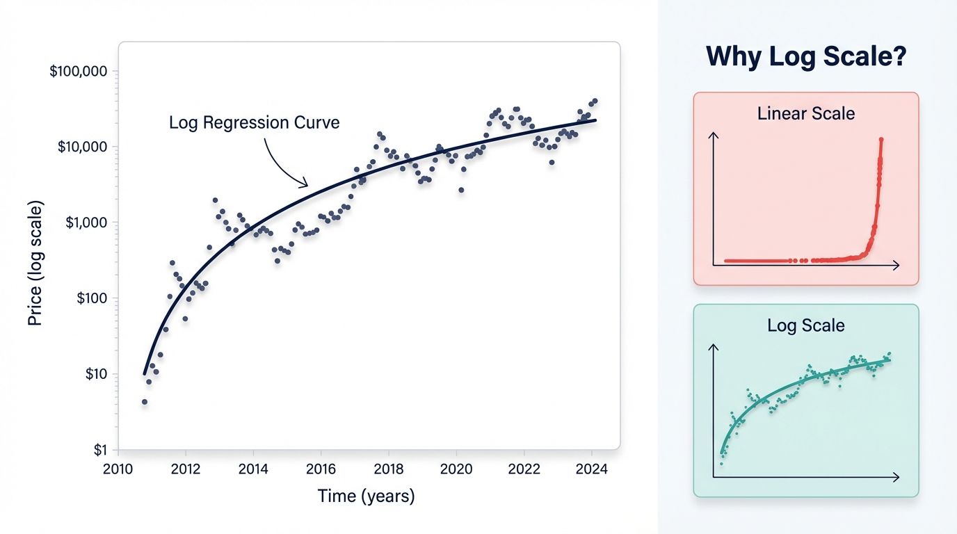
The foundation of the rainbow chart is a logarithmic regression applied to Bitcoin's entire price history. Because Bitcoin's price has grown by orders of magnitude over its lifetime (from fractions of a cent in 2009 to tens of thousands of dollars by the mid-2020s), a standard linear chart makes early price history nearly invisible. A logarithmic scale compresses the vertical axis proportionally, giving equal visual weight to a move from $1 to $10 as to a move from $10,000 to $100,000.
The regression line is calculated by fitting a best-fit curve through Bitcoin's historical closing prices on a log scale. This curve represents the "fair value" trend. The color bands are then drawn at fixed percentage intervals above and below that central regression line, creating the familiar rainbow appearance. Because the regression uses the full history of Bitcoin price data, the bands shift gradually over time as new data points are added. This means the chart is not static: a price level that was in the red zone several years ago may fall into the green zone today as the regression line moves upward.
The Color Bands Explained
The rainbow chart typically uses nine color bands, each carrying a distinct sentiment label. Starting from the bottom and moving upward:
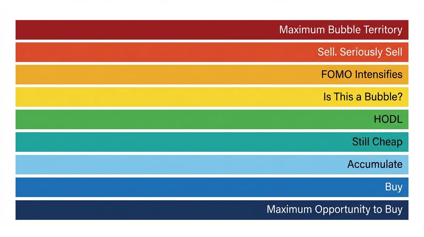
- Deep Blue ("Basically a Fire Sale"): The lowest band. Bitcoin trading here suggests it is significantly undervalued relative to its long-term trend. Historically rare, this zone appeared briefly during the 2015 bear market trough and again in late 2022.
- Blue ("BUY!"): Still deeply discounted territory. Long-term investors who entered here in past cycles have generally seen strong returns over multi-year holding periods.
- Light Blue ("Accumulate"): A moderately undervalued zone. The market may still be recovering from a correction but the worst of the downturn has likely passed.
- Green ("Still Cheap"): Bitcoin is trading below or near its historical growth trend. This zone is often associated with the early phases of a new bull cycle.
- Yellow-Green ("Hold"): Approaching fair value. No strong signal to buy or sell aggressively, but holding is generally comfortable.
- Yellow ("Is This a Bubble?"): Bitcoin is starting to outpace its long-term trend. Caution begins to increase here.
- Orange ("FOMO Intensifies"): Prices are meaningfully above the regression trend. The market is in a clearly bullish phase, but risk is elevated for new entrants.
- Red ("Sell. Seriously, SELL!"): Significantly overvalued relative to the long-term curve. Historical bull market peaks have often coincided with price action in or near this zone.
- Dark Red ("Maximum Bubble Territory"): The highest band. Bitcoin reaching this level would indicate extreme overextension. The 2021 bull run briefly touched this zone at peak prices near $69,000.
Where Bitcoin Is Now
As of March 2026, Bitcoin has been trading in a range broadly corresponding to the yellow-green to yellow bands on the rainbow chart, following a consolidation period after the strong bull run that characterized much of 2024 and early 2025. This positioning suggests Bitcoin is near its long-term trend value rather than deeply discounted or severely overextended. Macro conditions, including interest rate policy and institutional adoption dynamics, continue to influence whether the price drifts toward cooler or warmer bands in the coming months. Traders watching the chart are monitoring whether a move into the green accumulation zone presents a renewed long-term entry opportunity.
How to Use the Rainbow Chart for Long-Term Investment
Buying in the Blue and Green Zones
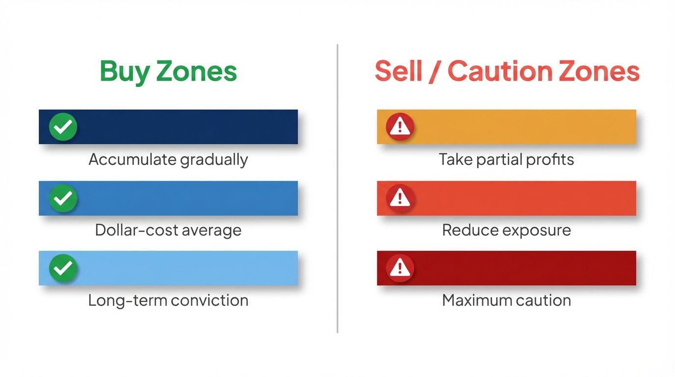
The most straightforward application of the rainbow chart is using the cooler color bands as a guide for accumulation. When Bitcoin's price falls into the blue or deep blue zones, the historical record suggests the asset is trading well below its long-run growth trajectory. Investors who dollar-cost averaged into Bitcoin during the 2018 to 2019 bear market (when price action lingered in blue and green territory) were rewarded substantially as the next cycle unfolded.
A practical approach is to set up price alerts for the band boundaries. For example, if you know the current lower boundary of the green band corresponds to a price around $55,000 to $60,000 (hypothetically, as bands shift with time), you can create an alert to notify you if Bitcoin approaches that level. This removes the emotional pressure of watching price tick by tick and transforms the rainbow chart into a systematic accumulation trigger rather than a source of anxiety.
It is also wise to combine the rainbow chart with a dollar-cost averaging (DCA) strategy rather than making lump-sum entries at a single price point. The bands define a broad zone, not a precise bottom, so spreading purchases across several entries reduces timing risk.
Taking Profits in the Orange and Red Zones
On the sell side, the orange and red bands have historically aligned with periods when Bitcoin was running significantly hotter than its long-term trend. The 2017 peak, the April 2021 high, and the November 2021 peak all saw Bitcoin trading in the orange-to-dark-red range before major corrections followed.
A disciplined approach is to begin reducing exposure gradually as price climbs through orange, rather than waiting for the dark red "maximum bubble territory" label. Greed and fear make it psychologically difficult to sell during parabolic rallies, which is precisely why having a pre-defined rule anchored to band levels is useful. Setting a ladder of sell orders at each band boundary moving upward creates a systematic profit-taking plan that removes discretion at the worst possible moment.
Portfolio rebalancing based on band position also works well for investors who prefer not to fully exit. Moving a portion of Bitcoin holdings into stablecoins as price enters orange territory, then redeploying those funds if price retreats to green, is a strategy aligned with the rainbow chart's core logic.
What the Chart Cannot Tell You
The rainbow chart has real limitations that every user must internalize. It does not tell you when a move between bands will happen. Bitcoin can stay in the blue zone for months or enter the red zone and climb even higher before reversing. The chart is a contextual framework, not a timing mechanism. It also says nothing about short-term price direction: a Bitcoin price sitting in the green band can still drop 20% before bouncing. The rainbow chart is useful for strategic positioning over months and years, not for deciding whether to buy or sell in the next week.
Bitcoin Rainbow Chart vs Other Long-Term Indicators
Traders who rely on the rainbow chart often cross-reference it with other long-term Bitcoin valuation models to build conviction.
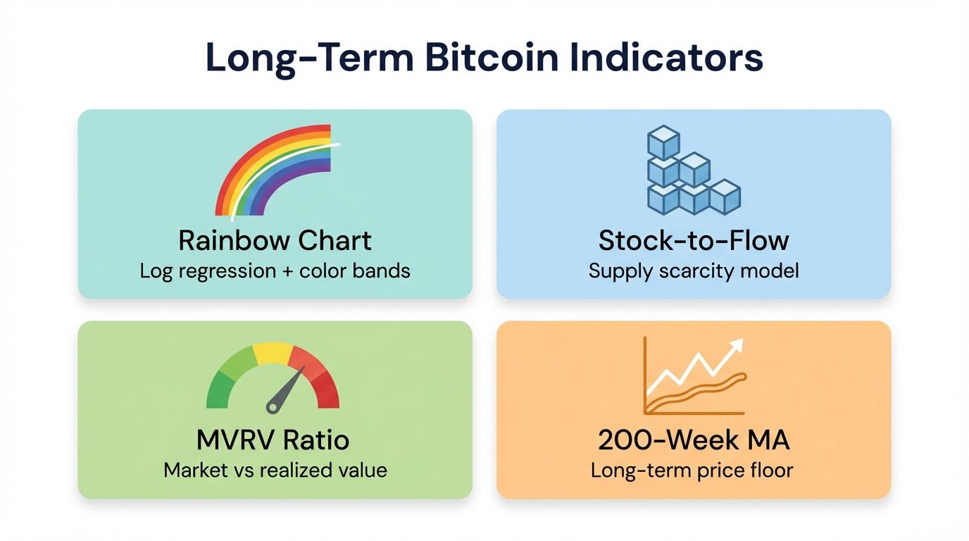
The Stock-to-Flow (S2F) model, developed by analyst PlanB, attempts to price Bitcoin based on its scarcity relative to annual new supply. While S2F generated significant attention between 2019 and 2021, its predictive accuracy has been questioned after Bitcoin failed to reach some projected price levels. Unlike the rainbow chart, S2F produces a single price target rather than a range of sentiment zones, making it more vulnerable to being clearly "wrong" in a given cycle.
The MVRV ratio (Market Value to Realized Value) is an on-chain metric that compares Bitcoin's current market cap to the aggregate cost basis of all circulating coins. An MVRV ratio above 3.5 has historically signaled overheated markets, similar to the orange and red zones on the rainbow chart, while a ratio below 1 has aligned with deep value accumulation zones. The MVRV is more dynamic than the rainbow chart because it responds directly to on-chain activity.
The 200-week moving average is a simpler tool that has historically acted as a long-term support floor for Bitcoin. Price touching or dipping below the 200-week MA has coincided with rainbow chart blue-zone territory in past cycles. Using these three tools together, the rainbow chart for broad zone context, MVRV for on-chain confirmation, and the 200-week MA for technical support levels, gives investors a more robust picture than any single indicator alone.
Common Misconceptions About the Rainbow Chart
The most important misconception is that the rainbow chart predicts price. It does not. The bands describe where Bitcoin's price stands relative to a historical regression line, not where it will go next. No regression model can account for macroeconomic shocks, regulatory changes, or technological disruptions that could fundamentally alter Bitcoin's trajectory.
A second common mistake is treating the bands as fixed price levels. Because the rainbow chart is built on a logarithmic regression that incorporates the full history of Bitcoin data, the dollar value corresponding to each band changes over time. The boundary between green and yellow that sits at $60,000 today may be at $90,000 two years from now as the regression line slopes upward. This is why quoting specific dollar price targets for each band without specifying the date is misleading.
Third, some market participants try to use the rainbow chart for short-term trading. The chart was built with multi-year time horizons in mind. During volatile periods, price can whipsaw through several bands in a matter of weeks, making band crossings unreliable as short-term signals. Its proper use is as a long-term positioning guide, not a day-trading trigger.
How to Find and Track the Rainbow Chart
The primary source for the Bitcoin rainbow chart is Blockchaincenter.net, which maintains an interactive version that updates in real time as new daily price data comes in. The chart on that site includes hover features that show the exact price boundaries of each band for the current date, making it easy to identify which zone Bitcoin is currently in without doing any manual calculation.
Several on-chain data dashboards also incorporate rainbow chart functionality or similar logarithmic regression overlays. Platforms that aggregate multiple Bitcoin valuation models in a single view allow traders to compare the rainbow chart's zone signal against MVRV, Puell Multiple, and other metrics simultaneously, which can be valuable for building a more complete picture before making portfolio decisions.
For practical tracking, setting price alerts at band boundary levels is more useful than checking the chart daily. The bands are long-term constructs, so their signal does not change meaningfully from day to day under normal conditions. Configuring alerts for key crossings, such as a drop into green or a climb into orange, ensures you are notified when an actionable threshold is reached without constant monitoring.
Using the Rainbow Chart Alongside Altrady
The Bitcoin rainbow chart provides a powerful macro framework for understanding where Bitcoin stands in its long-term cycle. But acting on that framework effectively requires timely alerts and a clear view of your portfolio across exchanges. That is where Altrady adds direct, practical value.
With Altrady's price alert system, you can configure notifications tied to the dollar levels that correspond to rainbow chart band boundaries for the current date. When Bitcoin approaches the green accumulation zone or climbs into the orange "FOMO intensifies" territory, your alert fires, giving you an actionable prompt to review your position. No more checking charts manually or missing key levels while you are away from your screen.
Altrady's portfolio tracker lets you see your overall Bitcoin exposure in real time across multiple exchanges, which matters when you are managing a multi-year accumulation plan aligned with rainbow chart signals. If you are reducing exposure as price enters orange, you need to know exactly how much Bitcoin you hold across all your accounts and at what average cost basis.
Altrady also supports grid trading and advanced order types, which pair naturally with a DCA strategy across rainbow chart zones. Start your free trial with Altrady today and see how professional-grade tools can sharpen the way you act on long-term signals like the rainbow chart.
Frequently Asked Questions
Who created the Bitcoin rainbow chart?
The Bitcoin rainbow chart was popularized by Blockchaincenter.net, which developed and maintains the most widely used interactive version of the tool. The underlying concept of applying logarithmic regression to Bitcoin price history emerged from community discussions on BitcoinTalk forums around 2014, with the visual color-band presentation evolving over subsequent years.
Is the Bitcoin rainbow chart accurate?
The rainbow chart has historically done a reasonable job of identifying broad accumulation and overvaluation zones across multiple Bitcoin market cycles. However, it is not a precise prediction tool, and the timing of price moves between bands can span many months. It is best used as a long-term context indicator rather than a trading signal on its own.
What color band is Bitcoin in right now?
As of March 2026, Bitcoin is broadly positioned in the yellow-green to yellow range on the rainbow chart, suggesting the price is near its long-term trend value rather than deeply discounted or significantly overextended. Band positions shift as the underlying regression updates, so checking the live chart on Blockchaincenter.net gives the most current reading.
Can the rainbow chart be used for other cryptocurrencies?
The rainbow chart was designed specifically for Bitcoin and relies on Bitcoin's 15-plus years of price history to build a statistically meaningful logarithmic regression. Applying the same methodology to altcoins with shorter or more volatile histories produces less reliable results. A few analysts have experimented with Ethereum rainbow charts, but these carry significantly higher uncertainty than the Bitcoin version.
Does the rainbow chart update automatically?
Yes, the version hosted on Blockchaincenter.net updates automatically as new daily Bitcoin price data becomes available. The regression line and band boundaries recalculate gradually over time as more data points are added, which means the dollar levels corresponding to each band shift slowly higher as Bitcoin's long-term growth trend continues.